Image from footyheadlines.com
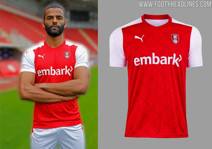
This season’s Rotherham shirts are the second and final contribution to the Championship from Puma, and this home shirt is exactly what I’d see if I closed my eyes and thought of a classic Millers shirt. Big chunk of red? Yes. White sleeves? Got it.
Don’t let that trick you into thinking that’s it though, as a closer look reveals some of that extra mile shirt fluff that afficionados love to see. The torso isn’t just a block of red, as a flicker in the wind would reveal a pattern within based on the shape of the sails on the mill housed in the club’s crest. Not only that, but the lines of that pattern are actually made-up of the club’s nickname typed over and over.
The aforementioned crest is woven, which is the crest gold standard for me, so it’s frustrating that everything else is heat transferred on, including the Puma logo. The front sponsor (embark) sounds like a call to action rather than anything else, but that’s fine. Let’s embark on a trip to the club shop to pick up one of these shirts.
7.9/10
Author: Greg Sykes @SykesGreg


Leave A Comment
You must be logged in to post a comment.